


Project overview
Public Kitchen is an O2O commerce platform launched in 2019 with the aim of improving the stagnant cooking class market. For the convenience of both culinary experts and students, Public Kitchen has given new vitality to the offline cooking class market by providing online applications for cooking classes, a space rental system, and sales of recipes and related products.
Following the onset of COVID-19, Public Kitchen saw a change in people's food culture and the market trend in which the online environment became rapidly activated, and seized the opportunity to expand its business. There was a need for new brand development to meet this market environment, and as a result, Public Kitchen used this project to develop a new brand name and brand identity design.

Cultural Insight
Recently, as most people spend more time at home, the frequency of having delivery food and home-cooked meals has significantly increased. In particular, Generation MZ, who value taste and experience, express their lifestyle by sharing content that introduces their food or recipes. Also, with the emergence of services that promote rapid delivery of food, the interest in "cooking recipes" and "home-cooked meals" has increased even among people in their 40s and 50s.
Core Value
As such, judging from the recent trend in consumers' diets, the new brand planned by Public Kitchen encompasses the needs of multiple generations for home-cooked meals. This allows even those who are new to cooking to easily make food with the help of a cooking master, and learn to cook without the constraints of time and space, even outside of the home. Therefore, we derived connectivity, simplicity, and convenience of gourmet as the core values of the new brand.
Brand Essence
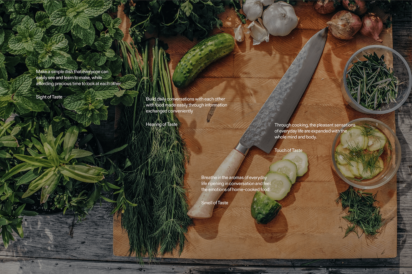
The difference between our new brand and the existing public kitchens is that we do not focus solely on the sense of eating. Our new brand platform provides a variety of cooking content, including cooking classes, and induces active communication among consumers about cooking, engaging consumers with all their senses. In other words, we provide a synesthetic experience. Furthermore, we expressed the expanded experience gained through cooking by adding the value of solidarity, where consumers can cook and enjoy food together at the time and place they want.
Brand Name
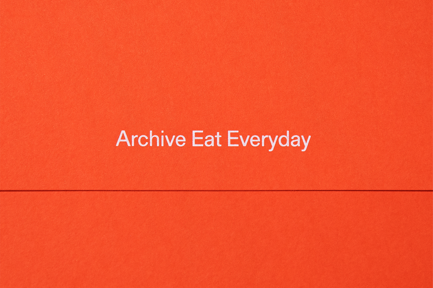
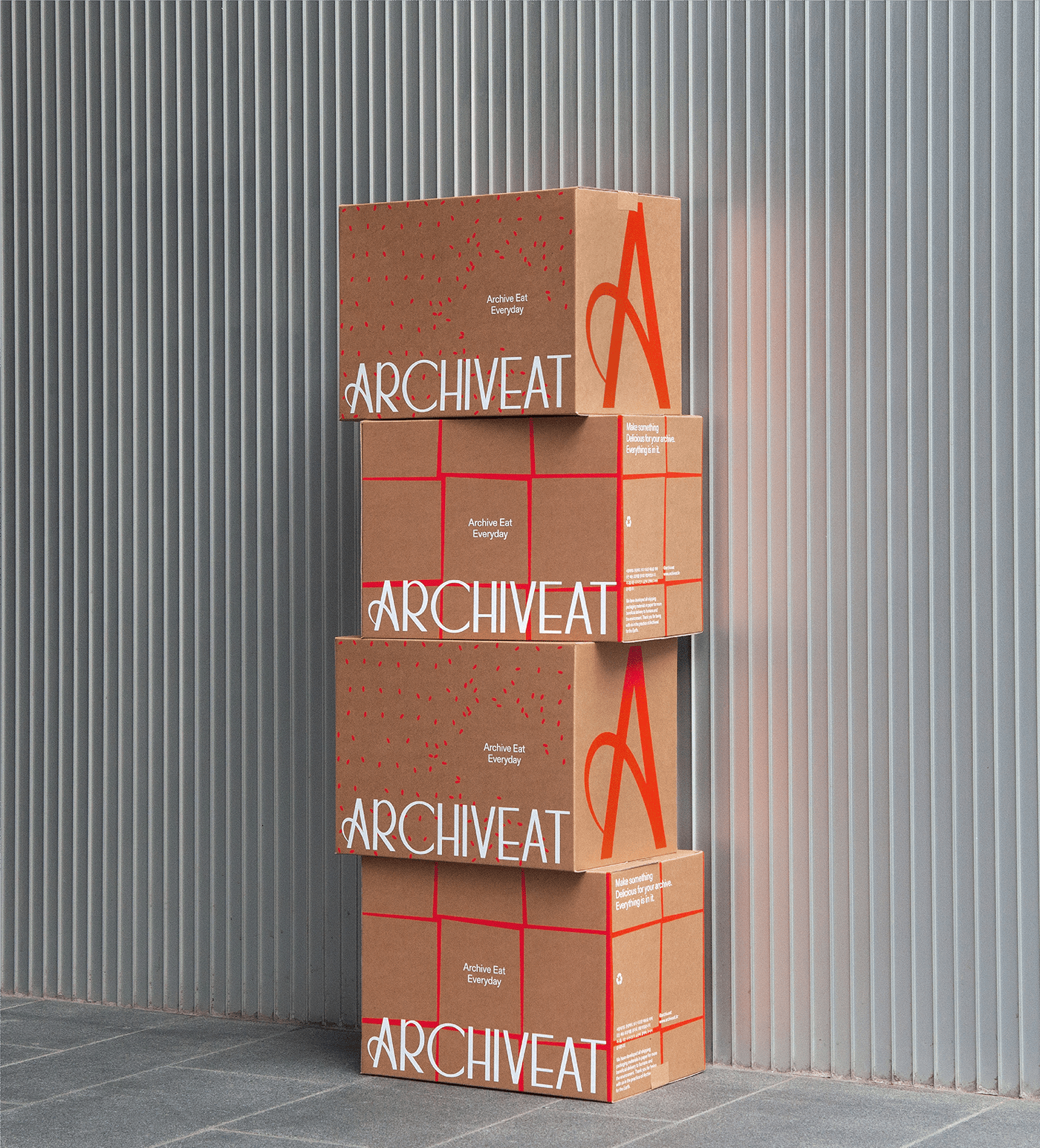
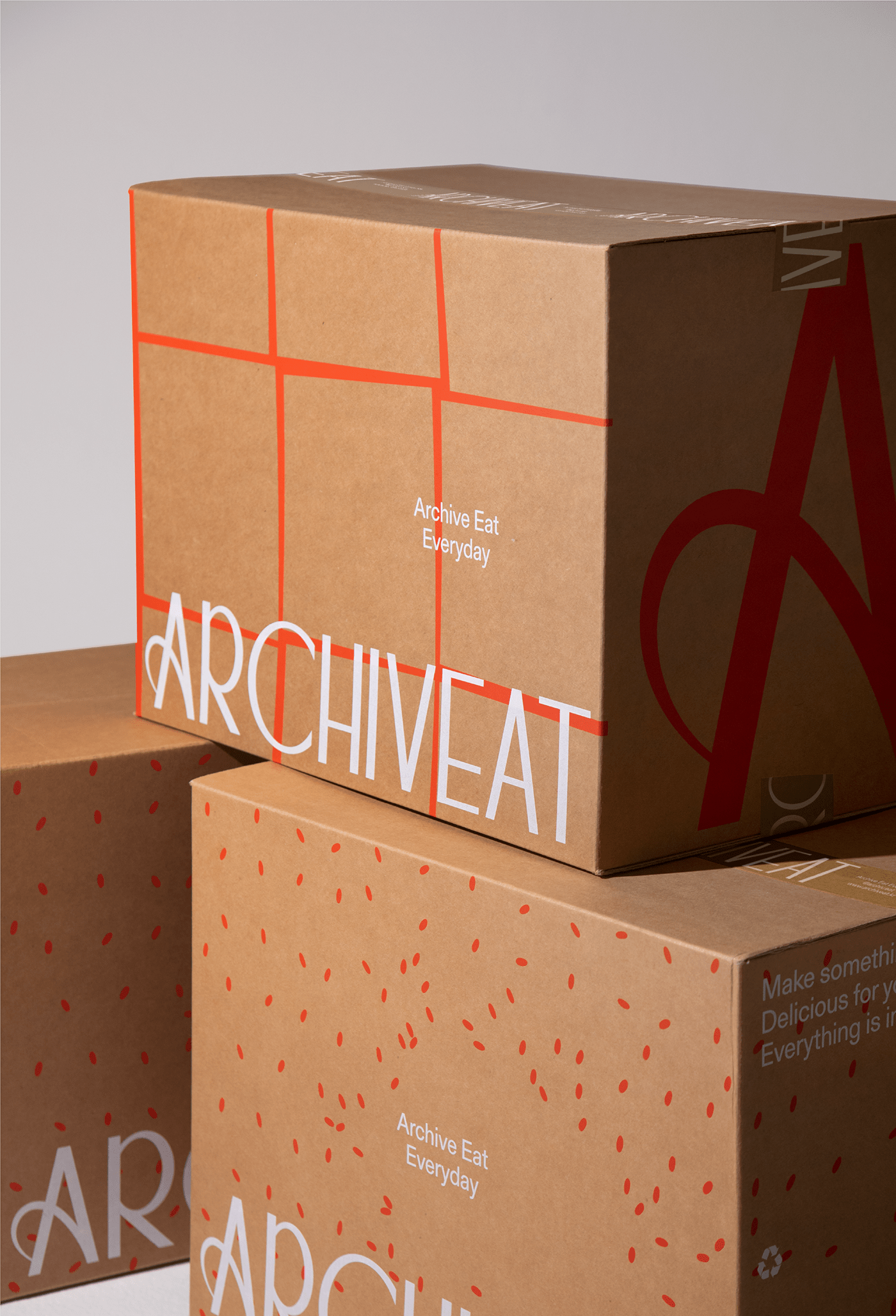
In order to raise consumer awareness of the brand at the initial point of contact, we wanted to develop an intuitive brand name that reveals business categories and characteristics. To this end, we combined Archive and Eat to create a new brand name called Archiveat, meaning a storage for cooking records that contains comprehensive knowledge about cooking.
Brand Slogan
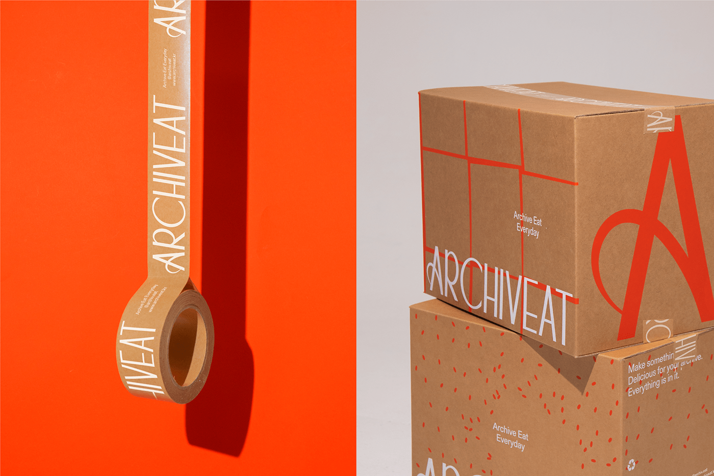
We have developed Archiveat's brand slogan so that consumers can easily recognize the brand name and recall the service characteristics. By directly utilizing the brand name, we repeatedly expose the brand to consumers, and by adding the meaning of every day, the slogan contains the benefits that consumers can think of it as a platform that can be useful in their daily lives.
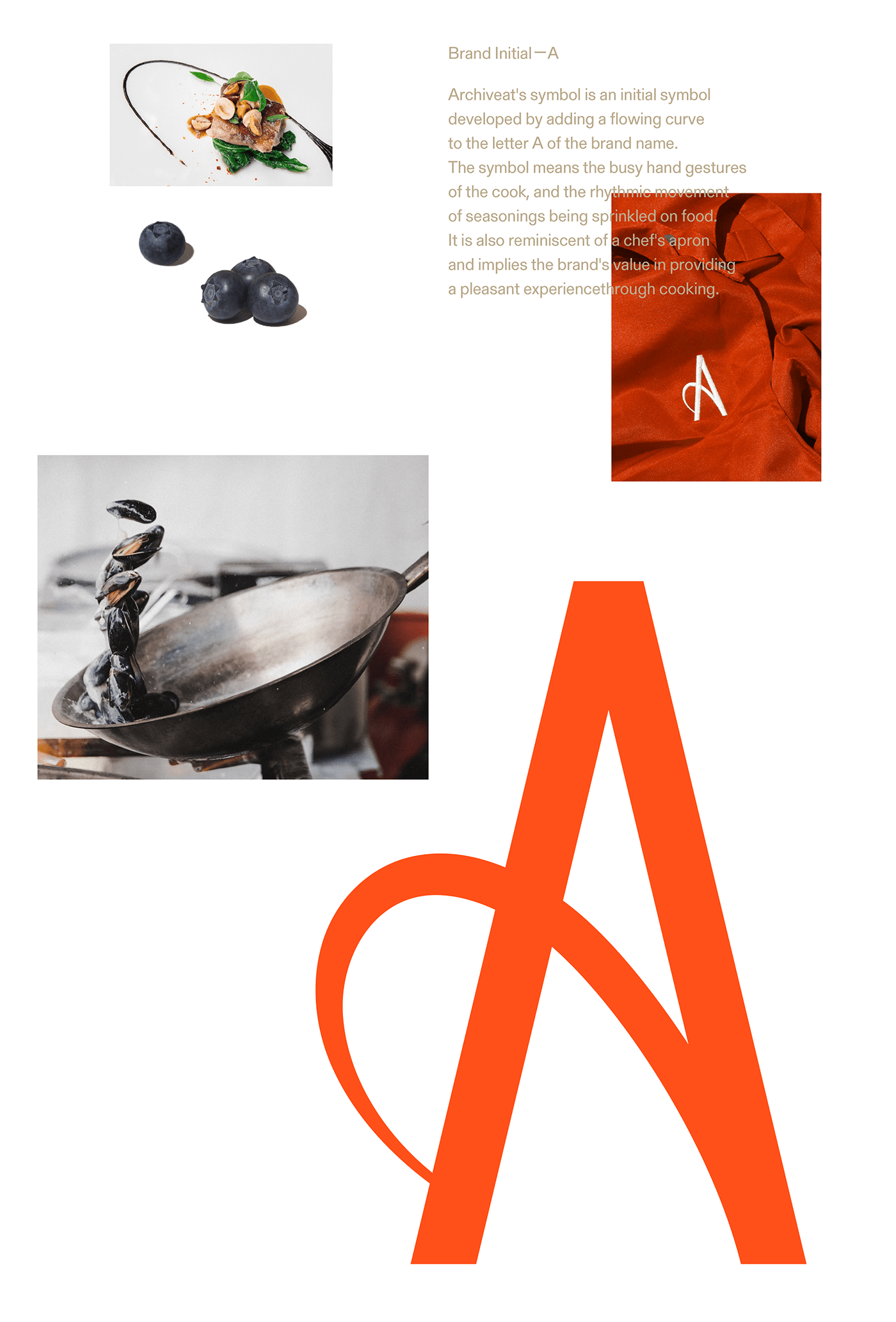
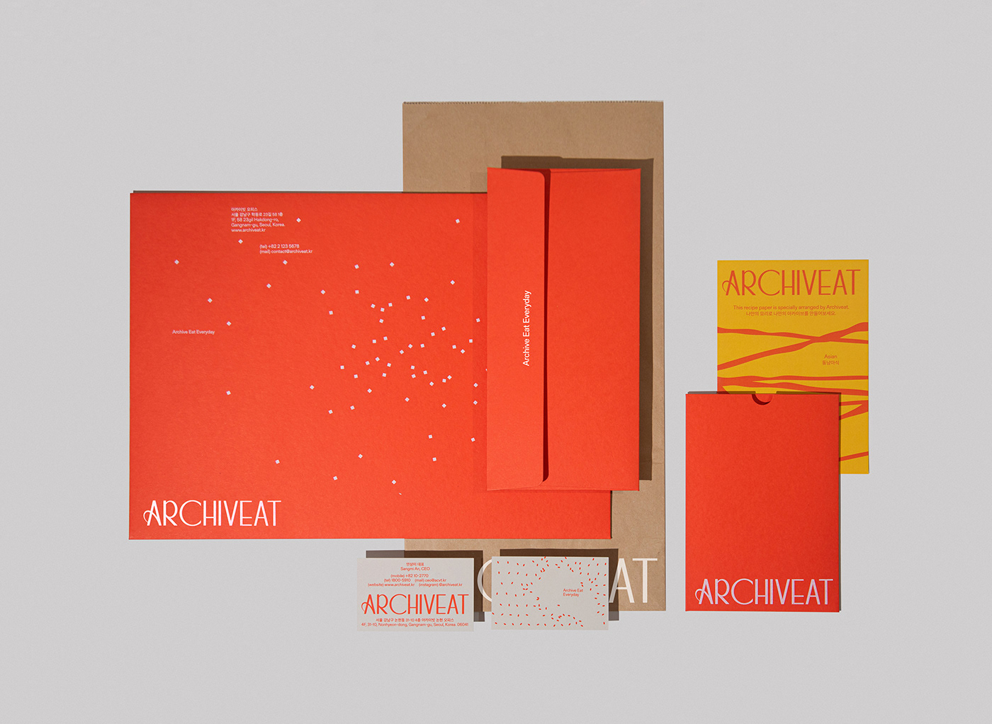
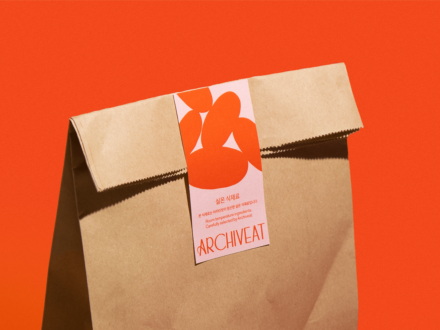
Brand logo
Archiveat's brand logo was developed in a geometric shape with thin letters to convey the impression of neatly sliced fresh vegetables. Also, the elegant curves of the letters A, R, and C have a dynamic and energetic format even within a rectangular frame, which conveys the service attributes of Archiveat, which contains all cooking experiences, in a sophisticated image.

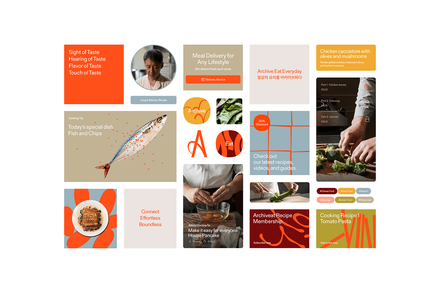
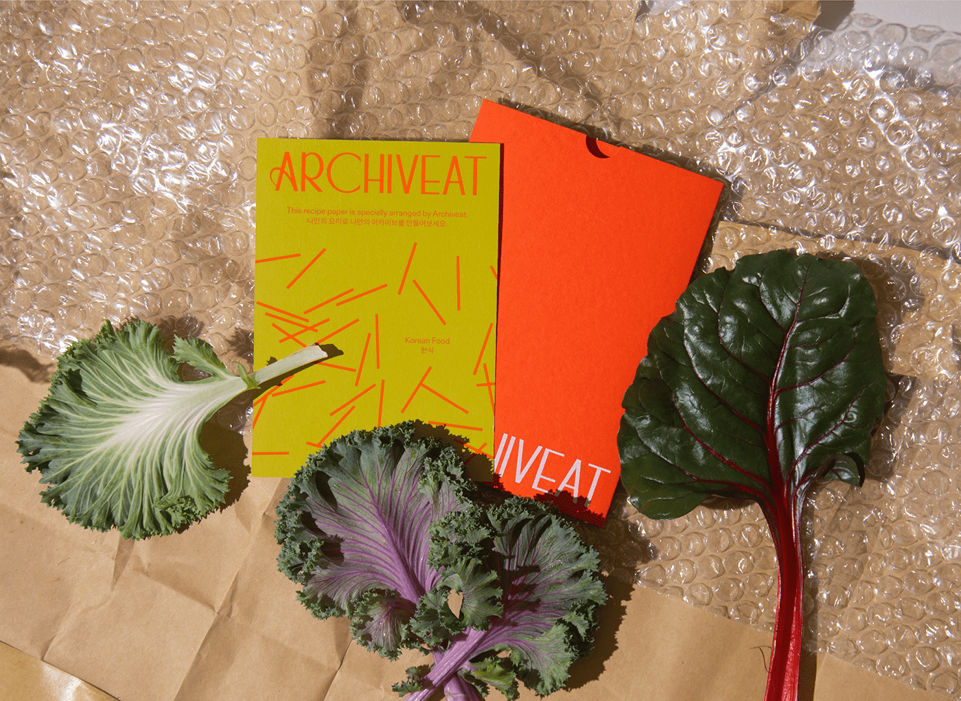
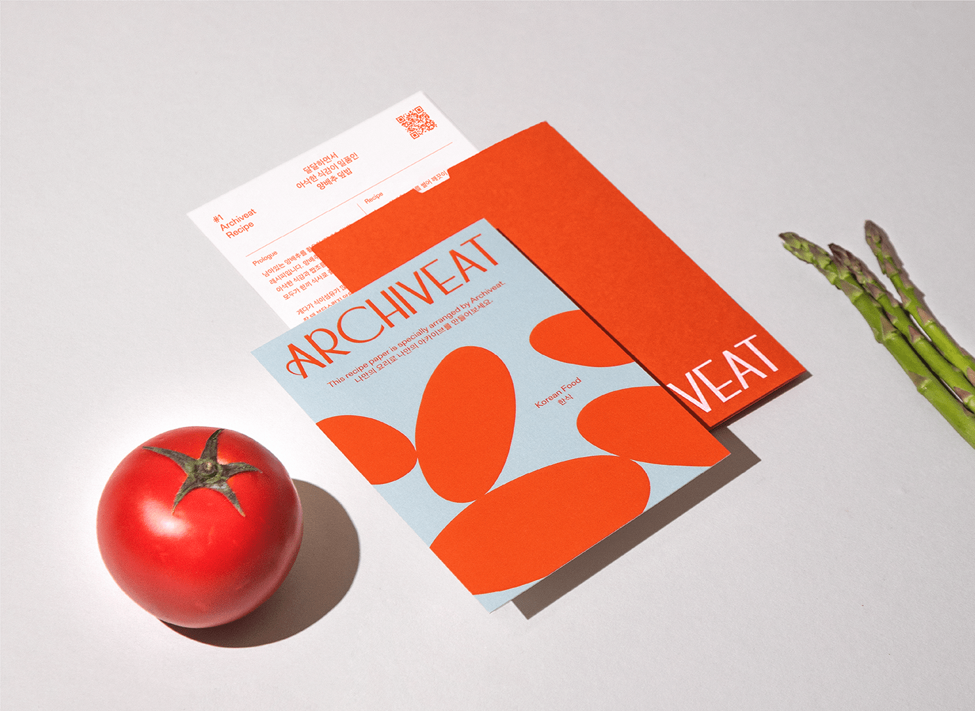
Key visual
A key visual is the most powerful design element that communicates the brand's identity at the point of contact where the brand meets the user. Archiveat's key visual is the sound heard during cooking: It was developed to visualize onomatopoeia such as chop chop chop, sizzle, bubbling, and crunchy so that people can intuitively feel the live cooking experience.
Color / Typography
Archiveat's main color symbolizes the joy of cooking, such as the seasoning of food and the appetizing appearance of food, and the secondary color is extracted from the ingredients so vital to the world’s cuisines. Also, the designated font utilizes Gerstner-Programm and Sandoll GothicNeo1, which excludes decorative elements and considers harmony between Korean and English, to better focus on the culinary content.

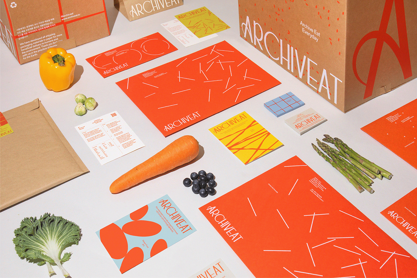
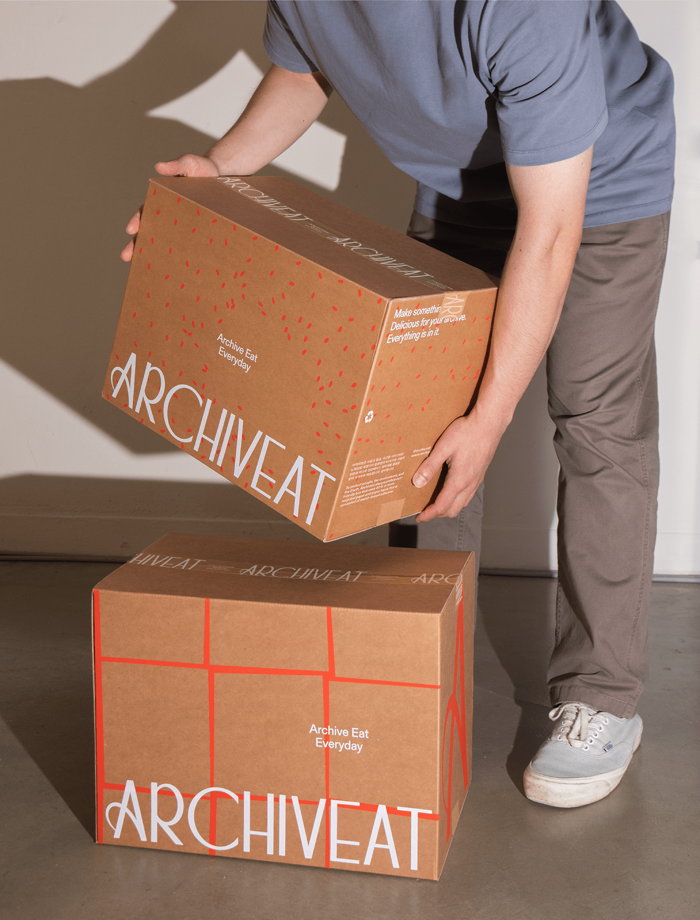
Brand Application
Archiveat's previously defined verbal identity and visual elements are applied in a consistent way
to the brand's various media, providing customers with an Archiveat style brand experience.


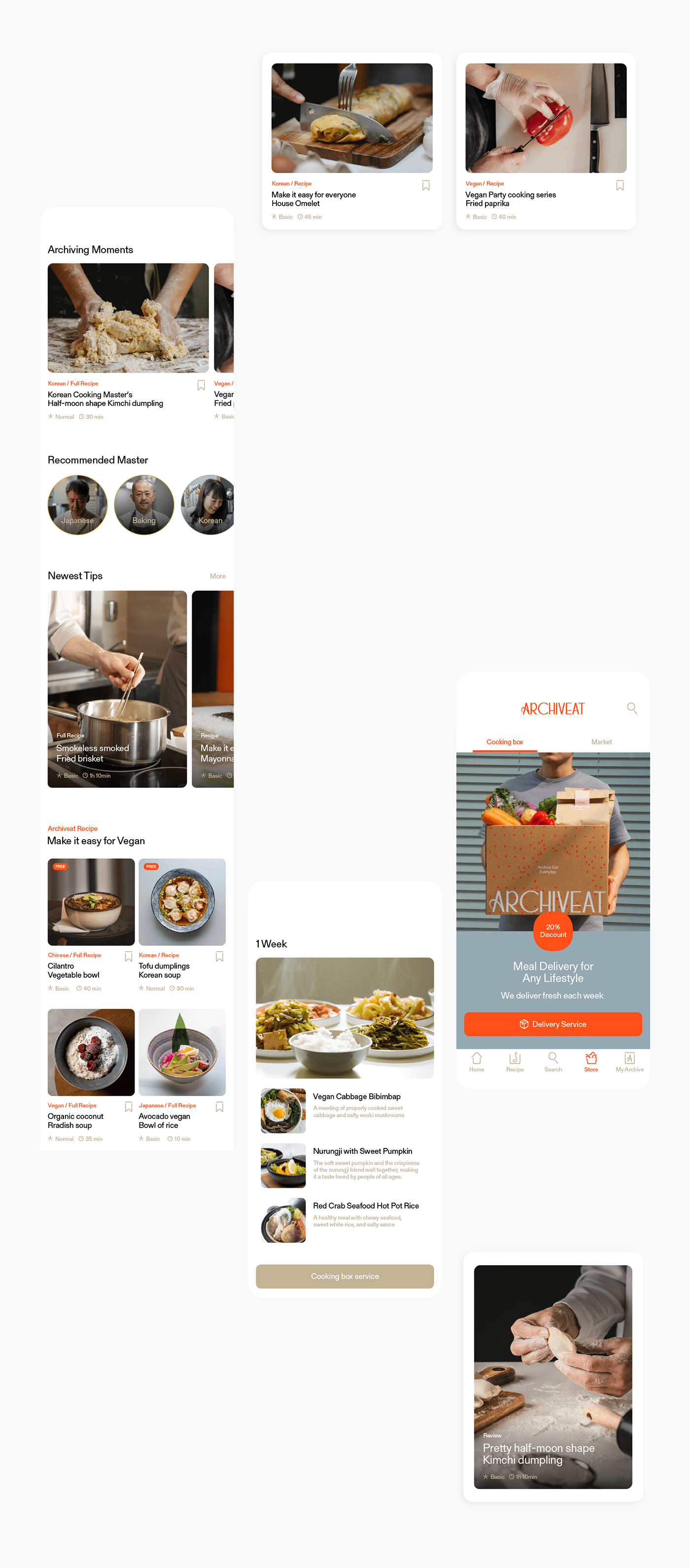
User Experience
Archiveat's app service was developed in the most intuitive way to deliver the latest cooking content as well as personalized recipes for each theme and situation in easy to consume video content. Users can also apply for a subscription delivery service for a cooking box linked to the recipe. This space activates community functions through cooking, Q&A sessions, and reviews of the cooking contents.


ARCHIVEAT
Brand identity development
2022
Plus X Creative Partner
Creative Director: Tyodi Hyojin Lee
BX Team Manager: Sunyong Kim
BX Strategist: Jeeyoung Song, Hyemin Oh
BX Design Director: Yoonseong Lee
BX Designer: Hwan Kim, Soyeon Lee, Seokjoon Kim
Public Kitchen
CEO: Sangmi An
CFO: David Choi
Contents Planner: Juae Choi
Producer: Daeun Huh, Suyoung Yun
©2022 Plus X Creative Partner


